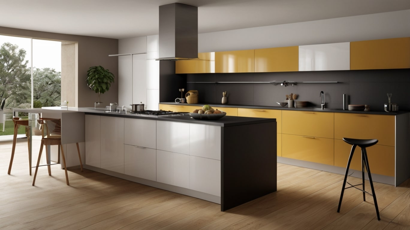
There’s something cheeky about a kitchen that flirts with two colors. Not chaotic, not loud but bold enough to whisper, hey, look at me. Two tone kitchens? Oh, they’re not a trend. They’re a movement. One foot in timeless design, the other in total personality. They don’t scream for attention they just get it anyway.
People used to pick one color and pray it aged well. Now? Now we mix things up. Think navy lowers and creamy uppers. Think black islands and oak cabinetry. Think contrast but make it classy.
Let’s dive into 20 kitchens that break the rules without burning the house down.
1. Midnight Green & Soft Walnut, The Cozy Luxe
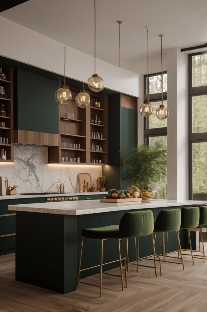
You’d never think green and brown could be posh, but this one nails it. The base cabinets wear a deep, velvety forest green, almost like they’ve been dipped in dusk. Overhead, soft walnut cabinets float gently like they’re not sure if they’re furniture or art.
It’s warm, but not rustic. Luxe, but not flashy. Imagine sipping hot tea at midnight, barefoot on cool terrazzo floors. Yep, that’s the vibe.
And the magic? That whisper of gold in the hardware. It’s like a wink from across the room.
2. Matte Black & Bare Concrete, The Urban Rebel
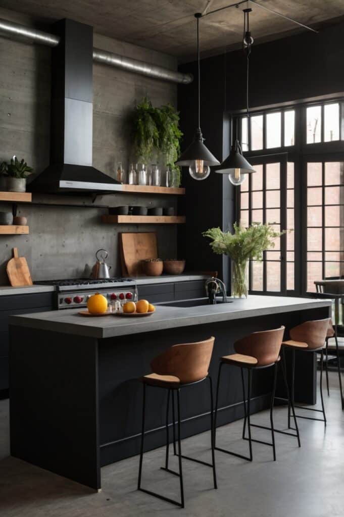
Now here’s one for the brave. Matte black on the bottom, raw concrete on top. Sounds harsh, yeah? But it works. Like a leather jacket over silk. It’s got edge, but depth too.
This kitchen doesn’t ask for permission. It just is. The black soaks up light like it’s got secrets. The concrete says, “I’ve been through things.” Together, they tell a whole damn story.
Drop in a few plants, maybe a worn-in leather stool or two, and boom it’s industrial poetry.
3. Blush Pink & Cream, Softness With Bite
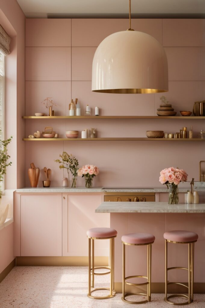
Okay, hear us out pink. Not bubblegum, not Barbie. More like dusty rose meets your favorite cashmere sweater. Paired with a soft cream, this two-tone palette wraps the room like a blanket.
It’s gentle, but not spineless. Feminine? Maybe. Strong? Oh yes. Picture brass knobs, marble countertops, and light that drips like honey through the windows. This is where you want to bake things from scratch, with messy hands and a quiet radio.
It’s the kind of kitchen that gets under your skin in the best way.
4. Navy & Brass, The Quiet Drama Queen
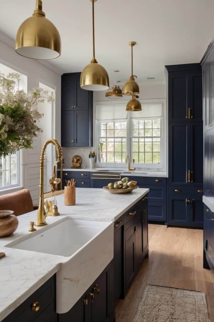
Navy blue has a way of anchoring a room. It’s not as moody as black, not as loud as red. It’s just… regal. Now pair that with brushed brass accents and warm white uppers. Boom. Drama, but classy drama.
There’s something old-world about it. Almost British, but with an edge. Think of a sea captain who reads poetry. That’s this kitchen.
The textures matter too matte blue paint, a hint of veining in the quartz, and brass that looks like it’s aged with pride.
5. Charcoal & Oak, Earthy, But Not Boring
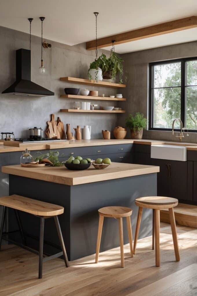
This combo doesn’t shout, doesn’t plead. It just leans back with its arms crossed like, go ahead, try me. Charcoal grey brings the mood, the oak brings the soul. Together? Pure balance.
The oak isn’t shiny it’s matte, a little knotty, maybe even a bit unpredictable. The grey has depth like a stormy sky at 4pm in November.
Pop in a few ceramic jars, leave a linen towel draped somewhere, and you’re living in an indie film set. But like, the good kind.
6. Sage & Ivory, Calm, Collected, Not Boring
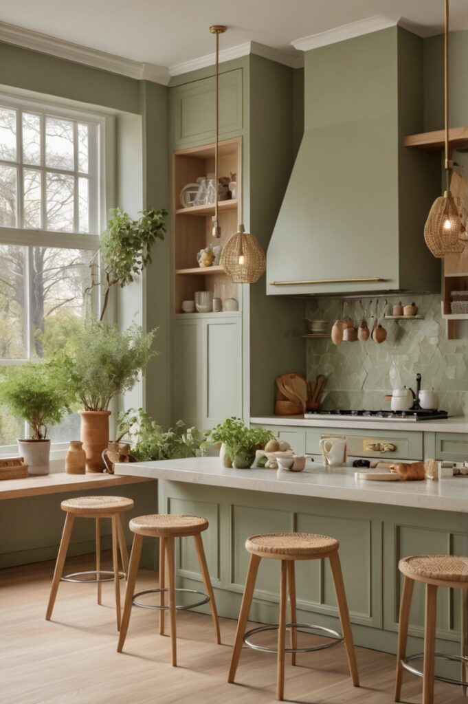
Sage green has had its moment, and surprise it’s not going anywhere. Pair it with ivory upper cabinets and you get serenity without slipping into bland.
This combo whispers in your ear instead of yelling across the room. It says, hey, breathe. Add in butcher block countertops, a handmade tile backsplash, and you’ve got a space that makes you wanna cook slow meals and sip wine barefoot.
There’s a softness to this one that invites presence. You don’t scroll on your phone in a kitchen like this. You feel things here.
7. Dusty Blue & Crisp White, Like a Fresh Shirt
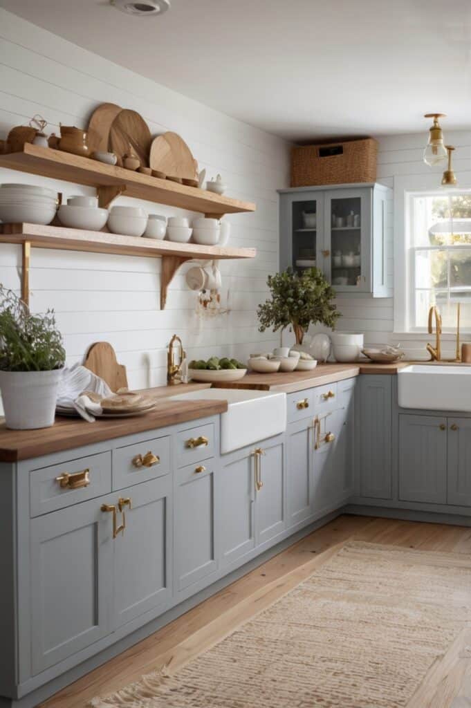
This one feels like clean laundry on a sunny day. The dusty blue on the lowers brings calm, the crisp white up top keeps it bright. It’s classic with a twist like someone who wears old Levi’s and quotes Rilke.
It’s a palette that won’t age badly. Ten years from now, it’ll still hold its head high. Pop in some matte black handles if you wanna edge it up. Or go polished chrome if you want to keep it sweet.
A kitchen like this doesn’t need to show off. It just shows up, and that’s enough.
8. Terracotta & Cream, Warm Like a Hug
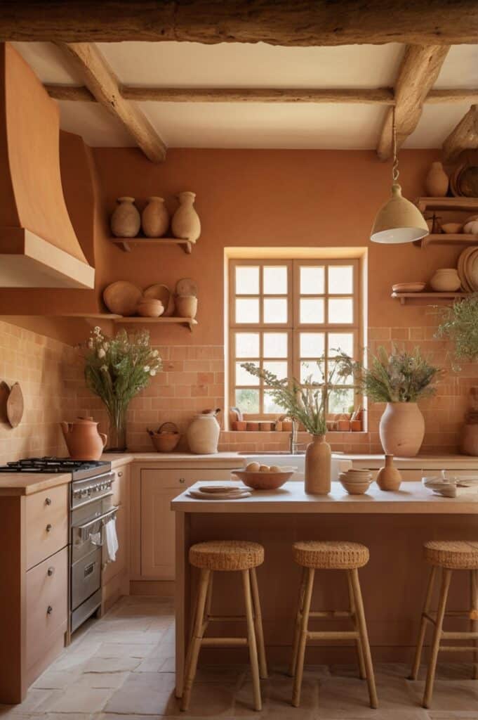
Now here’s one that feels like home. The lower cabinets come alive in a warm terracotta, earthy and grounded. Cream on the uppers keeps things light, airy. It’s sun-baked without being dusty.
Perfect for homes that want a touch of the Mediterranean without going full-on Tuscan villa cosplay. Add a few open shelves with pottery, maybe a woven rug, and suddenly you’re hosting pasta nights for people who bring good wine.
There’s soul in this combo. Old soul. The kind that doesn’t try, just is.
9. Steel Blue & Natural Birch, Cool Meets Light
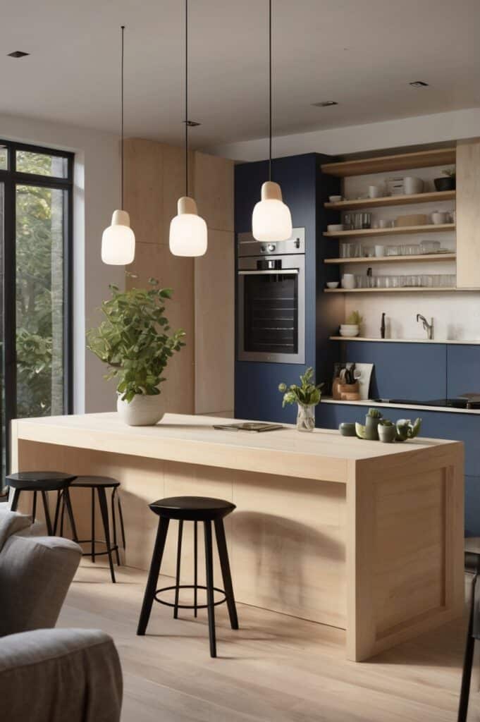
Steel blue brings the cool, but it’s never cold. Natural birch is like sunshine in wood form. Together? A little Scandi, a little modern farmhouse. But not Pinterest-farmhouse. More like “I live here and I’m chill” farmhouse.
This one’s for people who love open windows, pour-over coffee, and playlists that include both Bon Iver and Cardi B. There’s duality, and that’s the point.
The steel blue has weight. The birch floats. It’s the kind of space where you think better, breathe slower.
10. Black & White, But Done Right
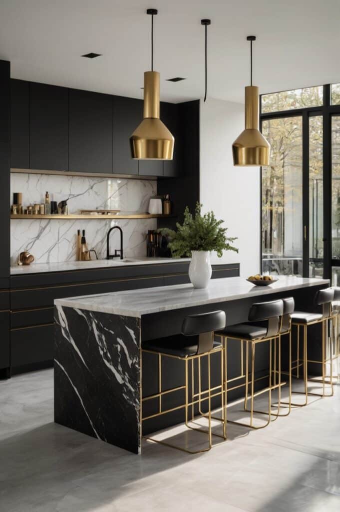
You’ve seen black and white kitchens. But have you seen this one? Matte black base cabinets with zero gloss. Not a hint. Pure shadow. And above? Not sterile white, but milky soft white almost like steamed milk.
It’s clean, but not cold. Minimalist, but not empty. Black quartz tops, maybe a waterfall island if you’re feelin’ bold. This kitchen’s got presence. Doesn’t smile a lot, but when it does? You feel it.
Add in a few surprises like wood bar stools or a pop of mustard somewhere and now it’s got layers. It’s not just a look. It’s a mood.
11. Burnt Mustard & Dusty Charcoal, Retro Grit
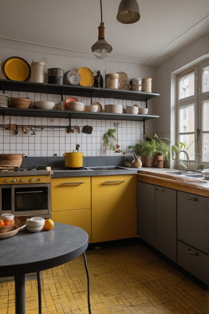
This one punches you in the face in a good way. Burnt mustard lower cabinets feel like vinyl booths in a ‘70s diner, in the coolest possible way. Dusty charcoal uppers pull it back from full costume drama and give it that grounded, lived-in thing.
It’s got soul, it’s got edge. Throw in a checkerboard tile floor if you dare. This combo doesn’t whisper it struts into the room like it owns it.
You either get it or you don’t. And if you don’t, that’s fine. It’s not for everyone. Just legends.
12. Cloud Blue & Pale Mango, Gentle Rebellion
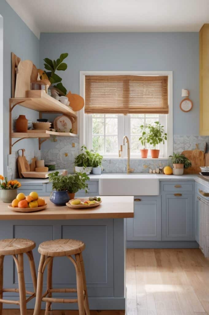
Yeah, mango. Not the fruit, the colour. Like, the pale part near the skin before it turns bright. Now pair that with a soft, lazy-sky blue. It’s weird. And it’s beautiful.
This combo feels like a vacation you weren’t supposed to take but did anyway. It’s light and moody at the same time how? Who knows. It just works.
The kind of kitchen that makes you wanna bake weird things and invite friends over on a Tuesday.
13. Olive Drab & Antique White, Understated Royalty
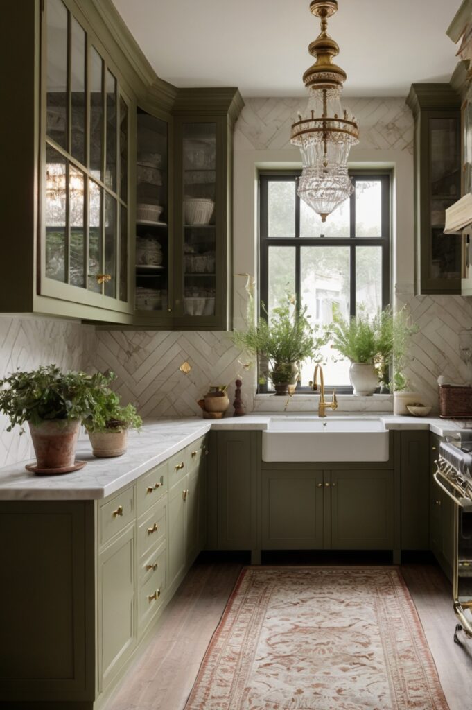
Olive drab? Sounds military, right? But trust when done in a matte, almost chalky finish, it’s rich, quiet, and strangely warm. Top it off with antique white uppers that look like they’ve seen generations.
Now you’re cooking like a French grandma with impeccable taste. And maybe a bit of an attitude.
Add iron handles and a deep farmhouse sink. Now we’re in business. This kitchen doesn’t beg for attention—it earns respect with silence.
14. Plum & Muted Linen, Moody Elegance
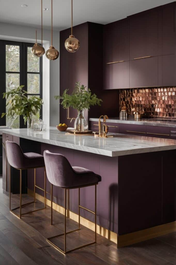
Plum. Not purple. Not violet. Plum. Like crushed berries at dusk. The base cabinets look like a novel you’ve read too many times. Above? Muted linen—almost grey, almost beige, but soft like old sheets.
This one doesn’t smile a lot, but it’s got a big heart. Throw in some aged bronze or oil-rubbed handles. Maybe stone countertops that look like they’ve weathered storms.
It’s the kitchen equivalent of slow jazz and candlelight. Not for speed. For savouring.
15. Clay Red & Pigeon Grey, Earthy, Urban, a Little Bit Punk
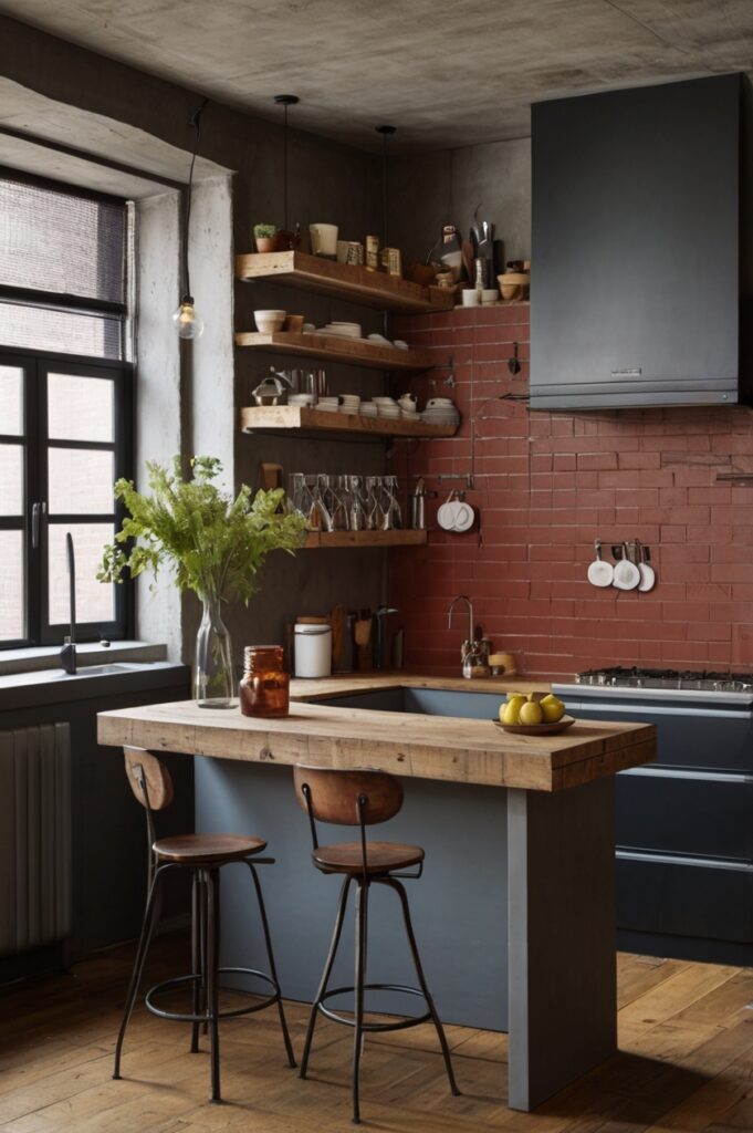
Clay red on the lowers like actual clay, fresh from the ground, damp and alive. Pigeon grey up top, soft and a little cool-toned. This combo shouldn’t work. But it really does.
It’s a little messy. A little undone. Like someone who wears ripped jeans and writes poetry on napkins.
Copper taps, open shelves, raw edges yes, yes, yes. This kitchen tells stories with its scars.
16. Faded Denim & Bone, Casual Cool
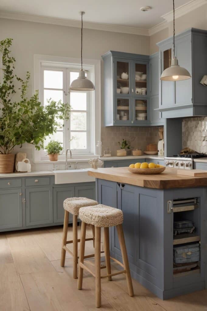
This is the kitchen equivalent of your favorite old jeans and a white tee. Faded denim lowers washed out, relaxed, slightly vintage. Bone uppers creamy but not too warm.
It doesn’t try to be fancy. That’s the charm. You walk in and immediately feel like you can breathe deeper.
Toss in reclaimed wood accents and some matte ceramic dishes, and suddenly it’s not just a kitchen it’s a Sunday morning mood.
17. Charred Teal & Toasted Almond, Deep Waters, Soft Sands
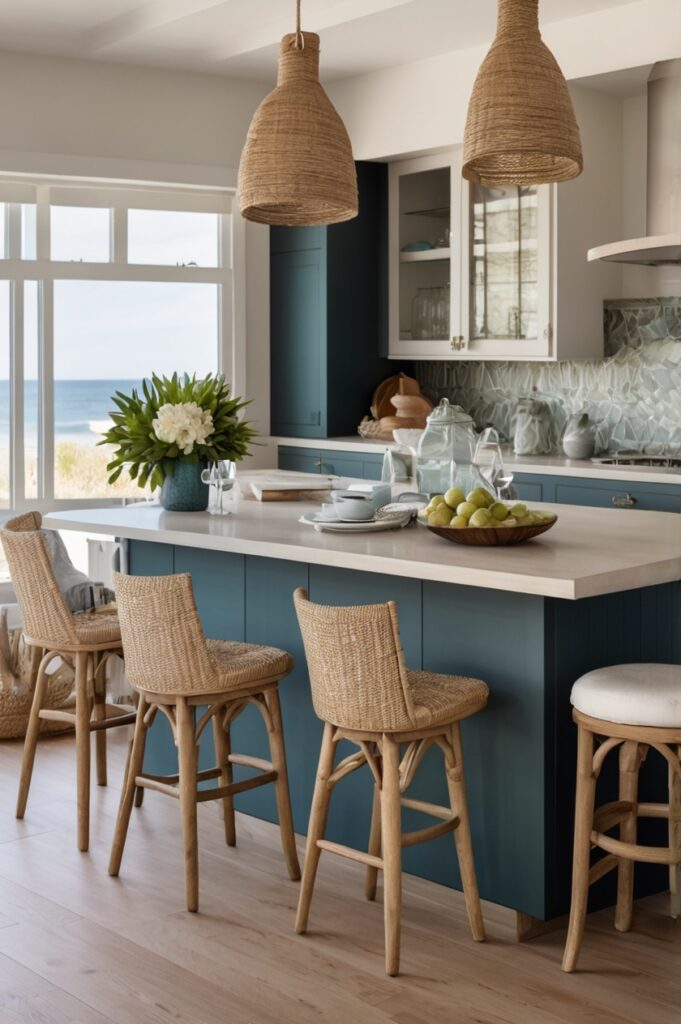
Okay. Charred teal. Like ocean water right before a storm. Not green, not blue, just… deep. Now pair that with a toasted almond top. Soft, nutty, a bit of sunshine.
This is a kitchen for someone who reads cookbooks like novels and collects sea glass for fun.
The whole space hums with contrast. Sharp and soft. Wild and warm. And honestly? It feels like freedom.
18. Lemon Ice & Navy Ink, Bright Meets Brooding
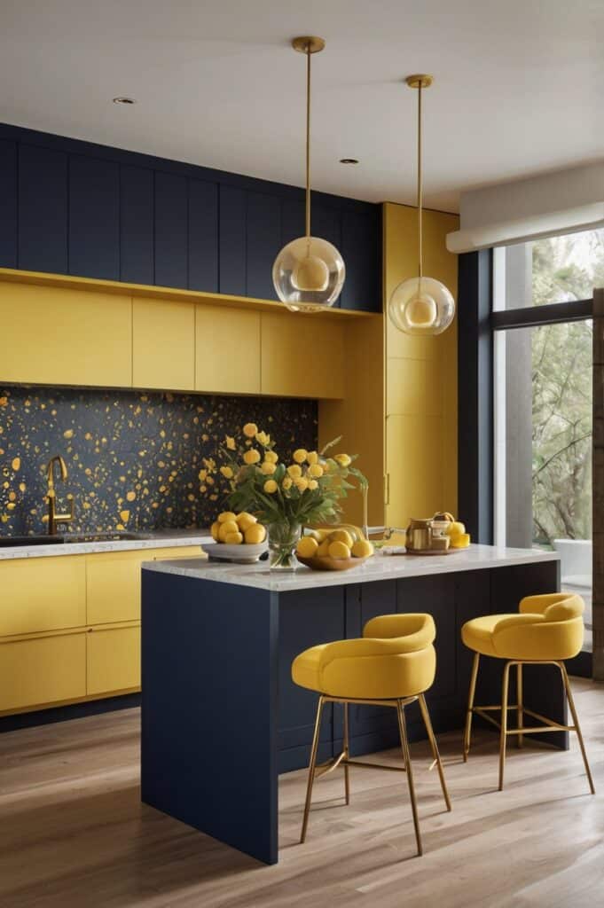
Hear us out. Lemon ice not neon yellow, but pale, pastel citrus. Paired with navy ink cabinets that sit heavy and noble. Together? It’s wild. But balanced. Light and dark, baby.
This kitchen walks a tightrope between playful and serious. Like a very well-dressed child prodigy. In a good way.
It forces the eye to move. The light dances. The dark grounds. You can’t be bored in a kitchen like this. Not even a little.
19. Moss & Mocha, Deep Forest Luxury
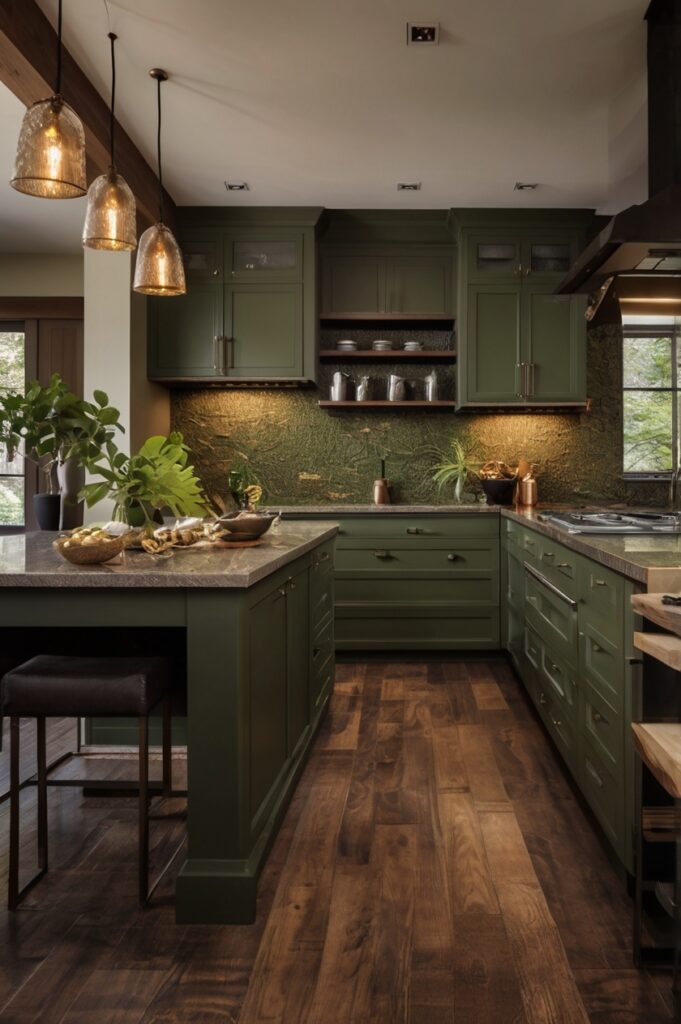
Now we’re talkin’ rich. Moss green below, with that lush, damp energy. Mocha above like melted chocolate, just shy of brown. It’s decadent without being sugary.
Add smoked glass doors on some upper cabinets. Maybe blackened wood handles. Now you’re not just in a kitchen. You’re in the woods, in a cabin, and someone just handed you mulled wine.
It’s dark academia meets organic living. And yeah, that’s a vibe.
20. Ink Purple & Warm Nickel, Royal With Restraint
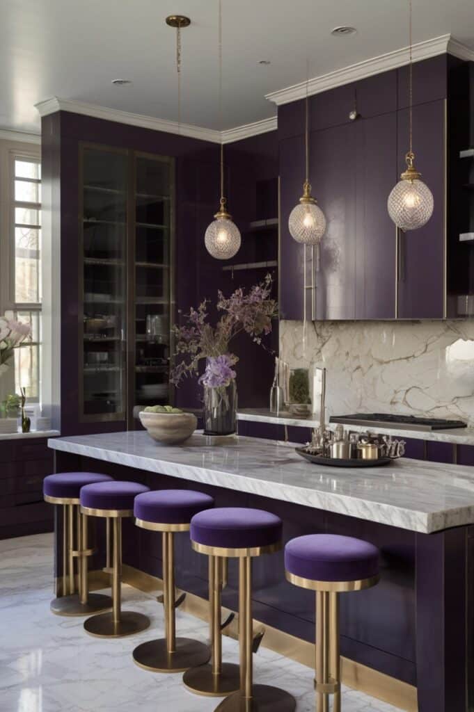
Ink purple. Not grape juice. Not lilac. Think: velvet, shadows, nightfall. Warm nickel upper cabinets yes, metallics, but brushed and soft, like fog over metal.
This is a kitchen for people who own actual wine glasses, not just mugs. It’s sharp, but not cold. Bold, but not chaotic.
It’s not everyone’s taste. Which is kind of the point.
Final Words
So why do these two-tone kitchens hit different? Because they feel like us contrasting, layered, a little imperfect. They’ve got moods. They’ve got moments. One color brings the calm, the other brings the chaos. It’s balance without being boring. They don’t follow the rules. They rewrite them. And they make space for you your story, your mess, your vibe.
You don’t need a showroom kitchen. You need one that laughs with you at midnight and holds your coffee at sunrise. Two tones let your space breathe. They give it rhythm. Go bold. Go soft. Mix old with new. But whatever you do, don’t play it safe. Because home isn’t beige it’s you. In full color.
